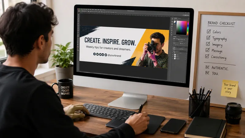
How Can Creators Make a Banner That Reflects Their Personal Brand?
A banner is often the first visual element people notice when they visit a creator’s profile, website, or channel. It introduces your style, communicates your message, and helps people recognize your brand within seconds. Learning how to make a banner that matches your identity is not just about good design. It is about telling your story in a way that feels consistent and memorable.
Whether you are a YouTuber, blogger, artist, musician, or entrepreneur, your banner should represent who you are and what your audience can expect. This guide explains how to create a banner that strengthens your personal brand while staying simple, professional, and visually engaging.
Why Does a Banner Matter for Personal Branding?
Your personal brand is the impression people form when they interact with your content. Every visual element contributes to that impression, including your logo, colors, typography, profile picture, and banner.
A banner works like a digital storefront. Before someone reads your content or watches your videos, they often see your banner first. If it looks polished and reflects your personality, visitors are more likely to stay and explore.
A strong banner also builds recognition across platforms. When people see similar colors, fonts, and imagery on YouTube, LinkedIn, your website, or social media, they begin to associate those visuals with your work.
According to the Nielsen Norman Group, users form first impressions of websites in a matter of seconds, making visual consistency an important part of user experience.
Key takeaway: A well-designed banner creates a strong first impression, reinforces your identity, and improves brand recognition across digital platforms.
What Is a Personal Brand?
Definition: A personal brand is the combination of your expertise, personality, values, voice, and visual identity that makes you recognizable to your audience.
Unlike a business brand, a personal brand focuses on the individual behind the content. Every design decision should support that identity.
Ask yourself:
- What topics do I create content about?
- What emotions should people feel?
- What makes me different?
- What do I want people to remember?
Answering these questions before you make a banner helps every design decision feel intentional rather than random.
Key takeaway: Your banner should communicate your identity before visitors read a single word.
Start With Your Brand Identity
Before opening any design software, define the foundation of your brand.
Think about your:
- Core message
- Target audience
- Primary content topics
- Visual personality
- Tone of voice
For example:
| Creator Type | Visual Style |
| Photographer | Large images, minimal text |
| Tech Creator | Clean layouts, bold typography |
| Lifestyle Blogger | Warm colors, approachable visuals |
| Musician | Dramatic imagery, expressive colors |
| Business Coach | Professional, uncluttered design |
Everything inside your banner should support one consistent message.
If your website already has branding guidelines, your banner should follow them. Likewise, if The Urban’s Beat has related articles on branding, visual storytelling, or creator marketing, consider linking readers to those resources for additional context.
Key takeaway: Clear branding decisions make banner design easier and more consistent.
Choose Colors That Match Your Personality
Color psychology influences how people perceive your brand.
While there are no universal rules, common associations include:
- Blue: trust and professionalism
- Green: growth and creativity
- Black: luxury and sophistication
- Yellow: optimism and energy
- Purple: imagination
- Red: excitement and confidence
Limit yourself to two or three primary colors.
Too many colors create visual clutter and reduce recognition.
Consistency matters far more than complexity.
Adobe’s design resources recommend maintaining a limited color palette to strengthen visual identity across platforms.
Key takeaway: A simple, consistent color palette helps audiences recognize your content instantly.
Select Typography That Supports Your Brand
Fonts communicate personality just like colors.
Examples include:
- Sans-serif fonts for modern creators
- Serif fonts for authority and editorial styles
- Script fonts for creative projects (used sparingly)
Avoid combining too many fonts.
Two complementary fonts are usually enough:
- One for headings
- One for supporting text
Large, readable typography performs better than decorative fonts, especially on mobile devices.
Remember that many viewers will see only part of your banner on smaller screens.
Key takeaway: Easy-to-read typography improves both branding and accessibility.
Use Images With Purpose
Images should reinforce your identity rather than fill empty space.
Good options include:
- Professional portraits
- Lifestyle photography
- Product images
- Illustrations
- Creative textures
- Branded graphics
Avoid generic stock photos whenever possible.
Authentic visuals build trust and make your brand feel more personal.
If you use your own portrait, choose one with consistent lighting and colors that match your other platforms.
Key takeaway: Every image should strengthen your message instead of distracting from it.
Keep Your Layout Clean
One of the biggest mistakes creators make is trying to include everything.
Your banner does not need:
- Every social media handle
- Long biographies
- Multiple slogans
- Dozens of graphics
Instead, prioritize:
- Your name or creator brand
- A short tagline
- Supporting visual elements
- Clear spacing
White space improves readability and directs attention toward the most important information.
Simple layouts often appear more professional than crowded ones.
Key takeaway: Less visual clutter creates a stronger and more memorable banner.
Design for Multiple Platforms
Different platforms display banners differently.
A YouTube banner differs from a LinkedIn background image or website hero section.
Before exporting your design:
- Check recommended dimensions.
- Keep important text inside safe areas.
- Preview on desktop and mobile.
- Test readability.
- Adjust image cropping if necessary.
Creating a flexible master design allows you to resize it for different platforms without starting over.
Key takeaway: A responsive banner maintains its impact across devices and platforms.
Add a Clear Value Statement
Visitors should quickly understand what you create.
Instead of writing:
“Welcome to my channel.”
Try something more specific:
- Helping freelancers grow online
- Weekly photography tutorials
- Honest tech reviews
- Creative design inspiration
A short value statement tells visitors why they should continue exploring your content.
Keep it under one sentence.
Key takeaway: A concise value statement gives visitors an immediate reason to stay.
Review Before You Publish
Before uploading your banner, ask yourself:
- Does it match my personality?
- Is it readable on mobile?
- Are colors consistent with my brand?
- Does it look professional?
- Is there enough spacing?
- Does it communicate what I create?
If possible, ask friends or members of your audience for feedback.
Fresh perspectives often reveal details you overlooked.
Remember that your banner is not permanent. Updating it as your brand evolves is completely normal.
Key takeaway: Testing and feedback improve both design quality and audience perception.
Common Mistakes to Avoid
Even experienced creators make branding mistakes.
Watch out for these issues:
- Using too many fonts
- Overcrowding the layout
- Low-quality images
- Inconsistent colors
- Tiny unreadable text
- Copying another creator’s style
- Ignoring mobile display
Your banner should feel unique while remaining simple and recognizable.
Key takeaway: Avoid unnecessary complexity and focus on clarity and consistency.
Frequently Asked Questions
How often should creators update their banner?
Update it whenever your branding, niche, or content direction changes significantly. Minor seasonal updates are also common.
Key takeaway: Update your banner when it no longer reflects your current brand.
What size should a banner be?
Each platform has different recommended dimensions. Always follow the latest official platform guidelines before exporting your design.
Key takeaway: Use platform-specific dimensions to ensure your banner displays correctly.
Should I include my social media handles?
Usually no. Visitors can already find your social profiles through the platform interface or website navigation. Use the space to reinforce your brand instead.
Key takeaway: Prioritize branding over unnecessary contact information.
Can beginners make a professional banner?
Yes. Modern design tools, templates, and brand guidelines make it possible for beginners to create polished banners with thoughtful planning and consistency.
Key takeaway: Strong branding matters more than advanced design skills.
Conclusion
A great banner is more than a decorative image. It represents your identity, builds trust, and helps audiences remember your content across every platform. When you make a banner with clear branding, thoughtful colors, readable typography, and authentic visuals, you create a stronger connection with your audience from the very first impression.
Keep your design simple, stay consistent across channels, and revisit your banner as your creative journey evolves. Small improvements over time often produce the strongest and most recognizable personal brands. For more information, visit our website.
Key takeaway: A successful banner combines consistent branding, simple design, authentic visuals, and a clear message to create a memorable first impression that supports long-term audience growth.


You May Also Like
Blog ThriftyEvents.net: Easy Budgeting Tips for Successful Event Planning
Application Mobile DualMedia: Complete Guide & Features